What is Color Theory in Miniature Painting? 5 Concepts to Know in 2023
What is Color Theory?
What is Color Theory? Color Theory is the term we use to label our collective understanding of how humans perceive color. It is a framework that guides the use, combination, and impact of colors in any visual composition. We apply Color Theory in art, marketing, design and any discipline that uses color in it’s structure. It provides a structured approach to color mixing, harmony, and contrast. Color Theory draws from physics, optics, and human perception.
Some principles of color theory include:
- The Color Wheel
- Primary, Secondary and Tertiary Colors
- Color Psychology: How Color Influences Emotion
- Contrast, Hue, Chroma and other objective measures of color
So in more simple terms, Color Theory is a large term that covers a lot of ground. Asking what is Color Theory like saying what is Math, or Sports. It covers a lot of ground and has a lot of components. Just understand it is the science and art of color.
How Does Color Theory Apply to Miniature Painting? Color Theory helps us understand how to make our miniatures look better. In the art world, we use color theory to help pick a color palate that will work well with what we are painting. If you ever considered what color to paint something, you’re involved in color theory. As you progress in miniature painting, you will often hear color theory terms like: highlight and shadow, contrast, complementary colors, saturated and desaturated, warm and cool colors, and more.
Miniature Painting is Art. Understanding the concepts that artists work with is a part of this hobby. If you’re on this site and reading this topic, maybe you’ve heard of contrast paints. Contrast is a large topic in Color Theory. When the painting or miniature has contrast, it looks better. Color theory helps us understand how to make our miniatures look better.
What is Color Theory in Simple Terms?
In simpler terms, color theory is like a rulebook for using colors. It helps you understand which colors look good together and why. Think of it as a guide that helps you pick the right colors to paint your miniatures, art project, repaint your room, design a poster, or even choose your outfit. It tells you how colors work together to make something look good and feel right.
How to Use Color Theory in Miniature Painting: 5 Main Concepts
I want to quickly go through the main Color Theory concepts you’ll use in Miniature Painting. The Five most important concepts to know in Miniature Painting are:
- Contrast
- Saturation
- Value
- Color Wheel (Color Palette)
- Highlight and Shadow
I will cover all of these below but I wanted to be specific with Miniature Painting here in this section. Next let’s look at some box art images of miniatures:
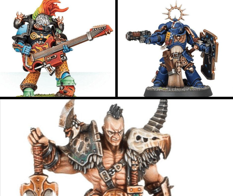
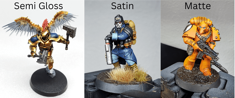
In the images above, note a few things. On the top left the Noise Marine has a lot of bright colors in his mohawk hairstyle. We would say they are saturated. But also notice he’s not fully covered in bright saturated colors. There is a lot of black and white in his armor and guitar. It breaks up the bright color.
In the next image you see a blue Space Marine. He is mostly blue, but you also see yellow and red in the color palette, which are all primary colors.
The bottom image of the Warhammer Darkoath Chieftan, look at his face. The top of his forehead is bright, and you clearly see the shadow down by his neck. He is mostly a caucasian flesh tone, with other muted (desaturated) colors on his sword and armor.
All of these concepts and more fall under Color Theory.
What are the main concepts of Color Theory?
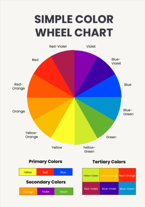
Color Wheel
The color wheel is a visual representation of colors arranged according to their relationships. It is a tool that brings structure to how color works.
In the 17th century, Sir Isaac Newton passed a beam of sunlight through a prism to reveal a spectrum of colors. He then connected the ends of that spectrum to form the first color circle, effectively creating the earliest version of the color wheel.
This not only advanced scientific understanding of optics and light, but also laid the foundation for modern color theory. It had an enormous influence on art and design by providing a logical framework for understanding color relationships.
Now rather than trial and error we can make educated choices on what color combination might work best for our projects.
Primary, Secondary, and Tertiary Colors
- Primary Colors: Red, blue, and yellow. These colors cannot be created by mixing other colors.
- Secondary Colors: Green, orange, and purple. These are made by mixing two primary colors. Mixing or adding is sometimes called additive color.
- Tertiary Colors: These are colors formed by mixing a primary and a secondary color, like red-orange or blue-green.
Color Harmony
Color harmony refers to the arrangement of colors in a way that is pleasing to the eye. Good color choice can be achieved through complementary, analogous, or triadic color schemes.
Contrast
Contrast is one of the most important concepts in miniature painting, and art in general. You can have contrast in color, saturation, temperature, texture and value. For example a dark blue contrasts a light blue. Yellow contrasts purple. A cool red contrasts a warm red. A grainy yellow contrasts smooth yellow. and so on.
Contrast involves using colors in a way that makes elements stand out from one another. The main concept here is contrasts helps you “read” the painting better. Your eye can more naturally see the figure or painting.
Saturation
Saturation describes the intensity or vividness of a color. A highly saturated color is bright, while a less saturated color appears more muted. Again this plays a huge role in art. When we say something is red, understand there is a wide range of color in that term.
Is it a bright saturated red? Think a shiny red apple or a bright red car. Or is it very desaturated, and almost pink.

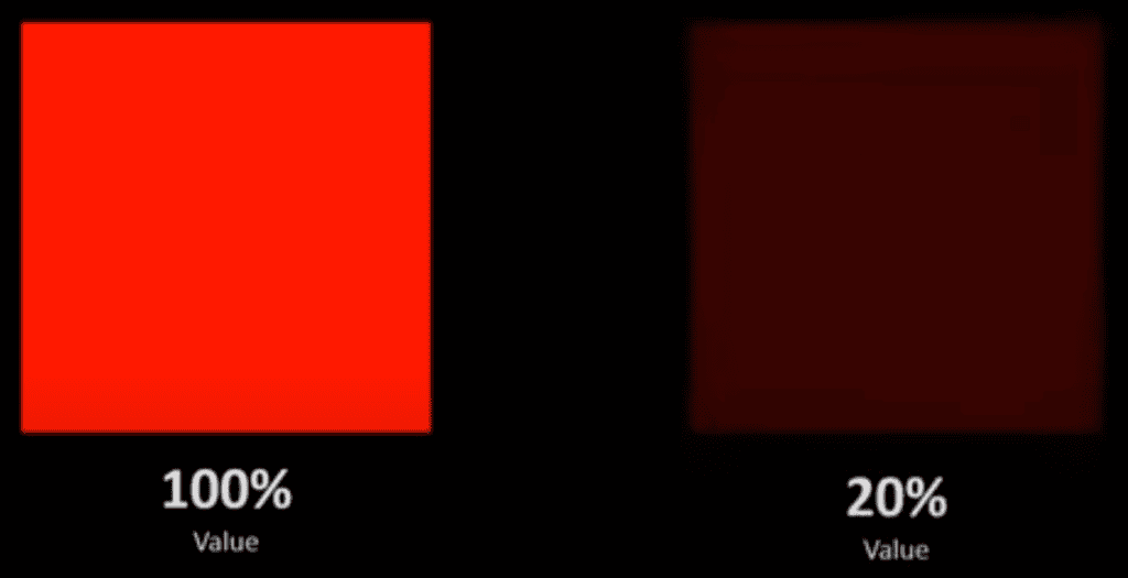
Value
Value refers to the lightness or darkness of a color. Adjusting the value can add depth and dimension to your designs. Here is a comparison to help you see the difference:
Hue
Hue is another term for color. In color theory, a hue refers to any pure color on the color wheel.
Warm and Cool Colors
For the simplest examples, warm and cool colors are broken down like this:
- Warm Colors: These are colors like red, orange, and yellow that evoke warmth and comfort.
- Cool Colors: These are colors like blue, green, and purple that are often associated with calmness and relaxation.
Generally speaking though, all colors can have a warm or cool association.
For example yellow: A warm yellow might tend towards the orange/red side of the color wheel. A cool yellow would shift more towards green.
Warm reds tend to be closer to orange or yellow, and cool reds shift towards purple and blue.
Chroma
In color theory, “chroma” refers to the purity, intensity, or saturation of a color. It describes how vivid, rich, or muted a color appears. Chroma is often confused with saturation, but they are not entirely the same.
Complementary Colors
Complementary colors are pairs of colors that, when placed next to each other, create the highest contrast and a vibrant interaction. They are opposite each other on the color wheel.
Examples include red and green, blue and orange, or yellow and purple. They are often used to achieve balance and harmony, although their high contrast can also produce a sense of tension or excitement.
In miniatures, be careful not to just choose bright versions of each color exclusively when trying to contrast them. For example bright purple and bright yellow. Look for opportunities to create contrast in saturation and brightness. Maybe a cold desaturated purple, with a small amount of a fairly warm, saturated yellow for some pop.
For some paintings, bright might work well. For others some depth makes the miniatures look more realistic.
Color Psychology
This involves the study of how colors can influence human behavior and emotions. For example, red is often associated with urgency or excitement, while blue can evoke feelings of calm and trust.
Color can be associated with behavior for evolutionary, innate reasons, or perhaps a learned association can be made.
Choosing a Color Scheme: Guidelines for Picking Colors with a Color Wheel
Here are some general tips for using a color wheel effectively when planning to paint a miniature:
- Start with a Base Color: Decide on a dominant color first, and then build your color scheme around it.
- Consider the Mood: Think about the emotional impact you want to create. Warm colors for energy and excitement, cool colors for calm and serenity.
- Test Before Applying: Always test your chosen colors together on a scrap piece of material to see how they interact.
- Balance is Key: Try not to overwhelm your miniature with too many vibrant colors. Balance out vibrant colors with more subdued or neutral tones.
- Don’t Forget Neutrals: Colors like white, black, gray, and brown can help to balance out your color scheme and provide areas of rest for the eye.
- Use a Physical or Digital Color Wheel: Having a color wheel at hand while you work can serve as a quick reference guide.
- Experiment and Adjust: Don’t be afraid to make adjustments as you go along. Sometimes the best results come from unexpected combinations.
Just a quick resource here for my fellow Warhammer 40k Space Marine fans, you can find various tools to help with color scheme. For example Bolter and Chainsword has this free Space Marine paint picker.
Another go to for me is an Instagram search or just a google image search for whatever I’m considering painting. It’s great for ideas and to get the creative juices flowing.
What are the seven types of color schemes?
Color schemes are combinations of colors that create an aesthetically pleasing visual experience. Basically, they make painted stuff look good. Understanding these schemes can be particularly useful in art, design, and even fashion. For Miniature Painting, they all come into play, but some more than others.
Here are the seven types of color schemes commonly used:
1. Monochromatic
A monochromatic color scheme uses variations in lightness and saturation of a single color. The best example here is greyscale. It’s a range from black to white. If you have heard of Zenithal Priming, that’s the classic greyscale example in miniature painting.
A black basecoat or primer, followed by spraying white from above. The result is usually fantastic. It simulates light and shadow, and the result gives it a sense of depth and value.
2. Analogous
Analogous color schemes use colors that are next to to each other on the color wheel. This scheme is often found in nature. However, it lacks the color contrast found in other schemes and can appear less vibrant.
3. Complementary
Complementary color schemes consist of two colors that are opposite each other on the color wheel, such as red and green or blue and orange. This scheme offers a high level of contrast, making each color appear more vibrant when placed next to its complement.
4. Split-Complementary
In a split-complementary scheme, one base color is chosen, and the two adjacent colors to its complement are used. This provides high contrast without the tension that can come from a standard complementary scheme.
5. Triadic
Triadic color schemes use three colors that are evenly spaced around the color wheel, like red, yellow, and blue. This scheme offers a balanced and vibrant look but should be managed carefully to avoid overwhelming the look.
A rule of thumb I recommend is picking a dominant color to take up roughly 2/3rds the painting, then splitting the rest of the painting among the remaining 2 colors.
Designers use a 60-30-10 rule, where 60% is the dominant color, then 30% for your next color, and finally 10% for an accent color. This is not a hard and fast rule, but more of a guideline.
6. Tetradic (Double Complementary)
A tetradic color scheme involves four colors arranged into two complementary pairs. This scheme offers more color variety and can be balanced by one dominant color while using the others as accents.
7. Square
The square color scheme uses four colors that are evenly spaced around the color wheel. Like the tetradic scheme, it offers a rich array of colors but requires careful balance to ensure coherence. Meaning don’t go too crazy with a lot of colors.
Each of these color schemes has its own set of advantages and challenges. Again I like to look at examples to get my mind flowing. You can also trying and figure out what scheme they’re using and adapt your own spin on it.
I know that is a lot of information. Color Theory is a very broad topic and we’ve covered a ton of ground. It’s a great start though. If you’re interested in an excellent book on the subject I highly recommend Color and Light by James Gurney. It’s about realist painting, and can help you in understanding color theory concepts as they relate to miniature painting.